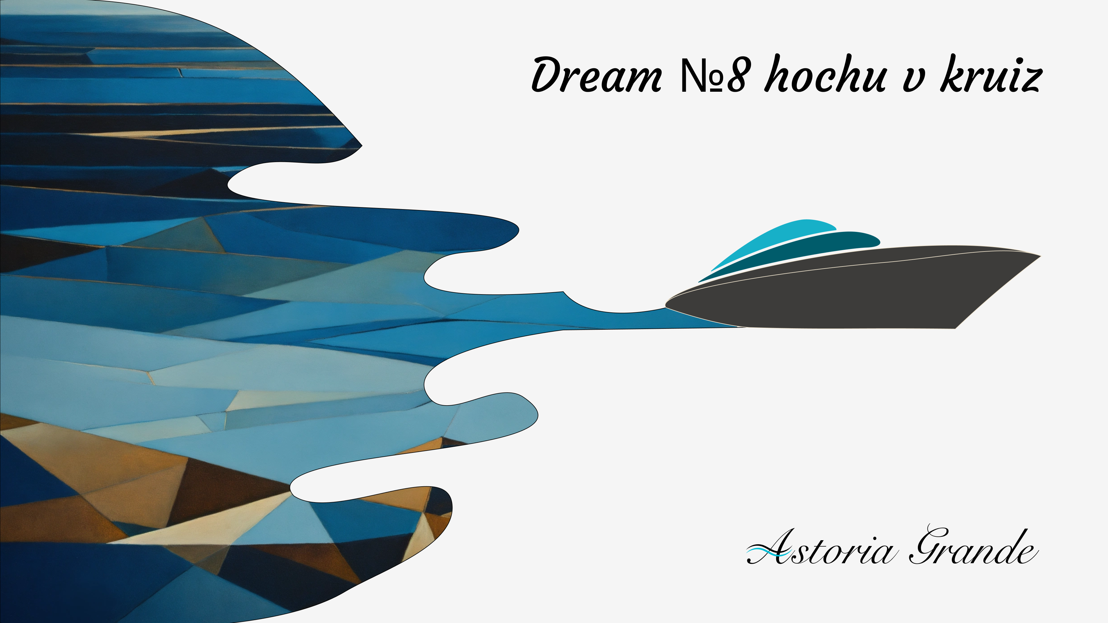
Astoria Grande — Simplifying the Booking Journey
UX audit and redesign of the mobile cruise booking flow using the AS IS → TO BE methodology. Step-by-step funnel analysis, eliminating drop-off points, and building a clear experience — from search to booking confirmation
About the project
Astoria Grande is a cruise company operating sea voyages from Sochi to Turkey, Greece, Georgia, Israel, and Italy. The primary sales channel is the mobile website, where users search for cruises, select cabins, and book trips.
The brief: conduct a UX audit of the current booking flow and simplify it as much as possible. The user journey from the first screen to booking confirmation was long, confusing, and losing people at every step. The methodology: AS IS → TO BE — document the current state, collect all problems, design a new experience.
AS IS: analyzing the current flow
First step — a full audit of the existing mobile site. The team walked through the entire booking path as a user: from the homepage to booking confirmation. At every step, problems were documented: where the interface confuses, where context is lost, where users make decisions blindly.
Search as the entry point
In the old version, search was a secondary element on the cruise list page. No CTA, unclear where to click. Users didn’t know where to start — browse the list or search.
Search was moved to the hero zone as the single action on screen. Direction, dates, passengers — sequentially, not all at once. Each step is a separate screen with visual focus: country cards with photos for direction selection, a calendar with flexible dates, a clear passenger selector. Visual emphasis on the “Find cruise” CTA.
Target metrics: users utilizing search (not scrolling) → target +20%. Time-to-first-action → target −20%.
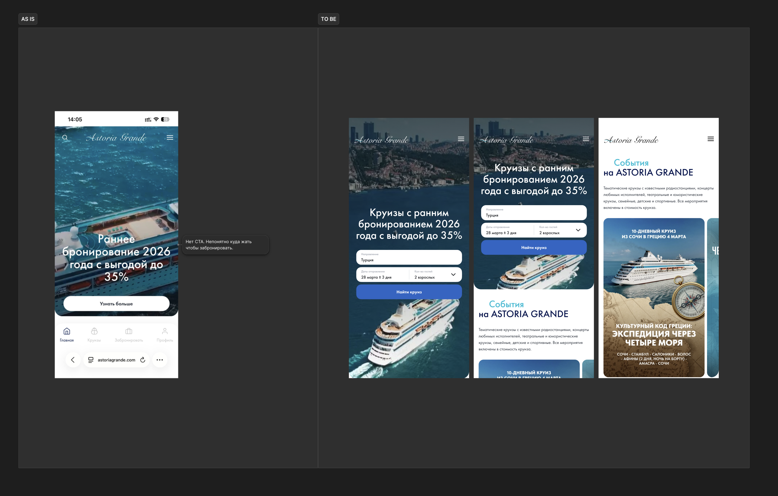
Home screen: AS IS → TO BE
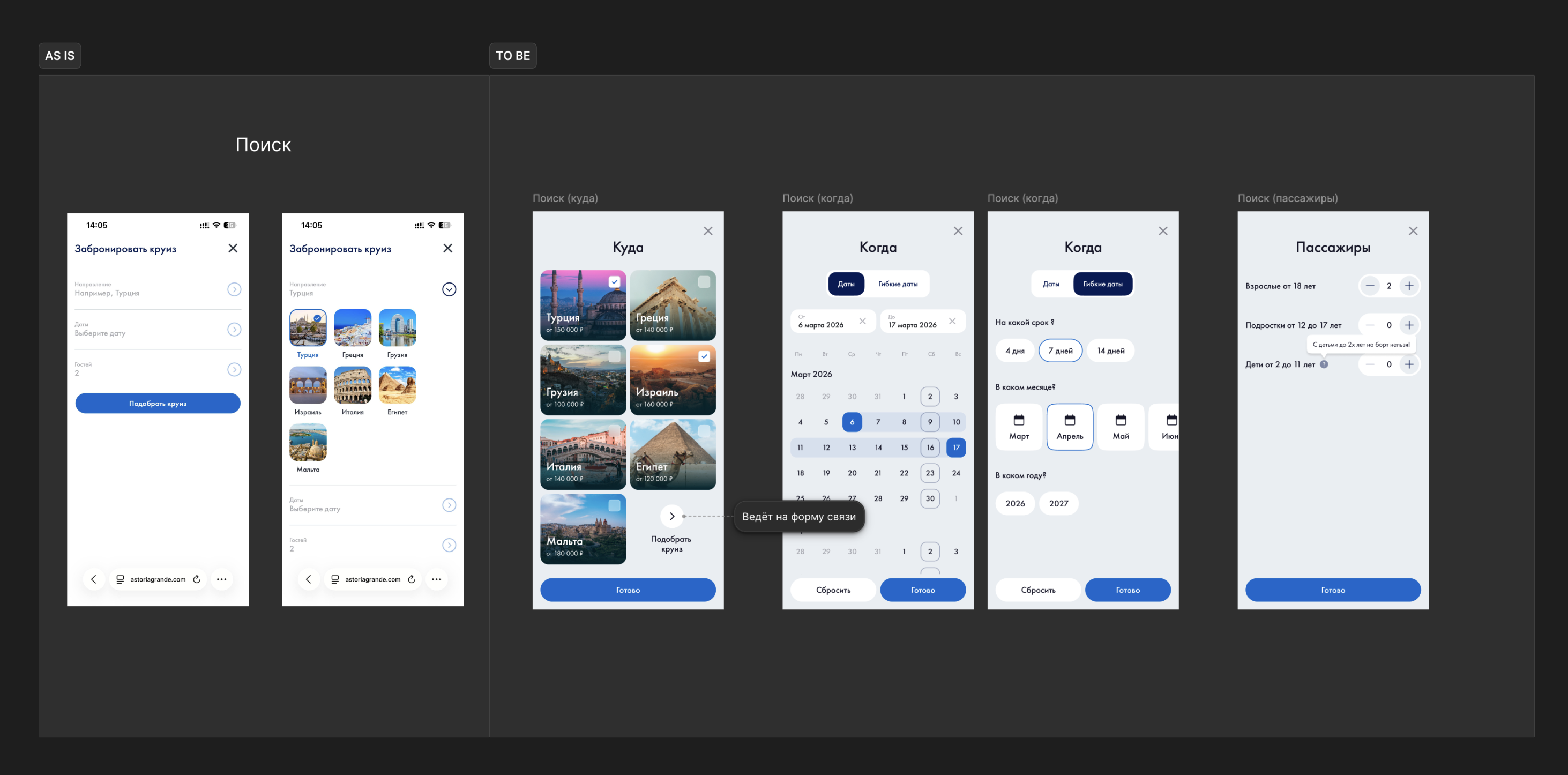
Search: step-by-step direction, date, and passenger selection
From rows to cards
The old cruise list — flat rows with minimal visual information. No price/route/date hierarchy. Choosing from identical rows slows decision-making.
Cards with large photos, clear route, dates, and pricing. Visual hierarchy: photo → name → price → button. Users scan, not read.
Target metrics: card CTR → target +15%. Time on list screen → target −10% (less = more confident choices).
Context before booking
In the old flow, the cruise page was practically absent — users went straight to the cabin selection form without context. No route, no dining, no entertainment. Decisions were made blindly.
A full-featured page was designed: photos, route with map, daily schedule, program, other cruises by direction. Users convince themselves before moving to booking. This isn’t an extra step — it’s a step that increases conversion.
Target metrics: scroll depth 50%+ reaching the “Route” block. Conversion from cruise page to booking → target +15%.
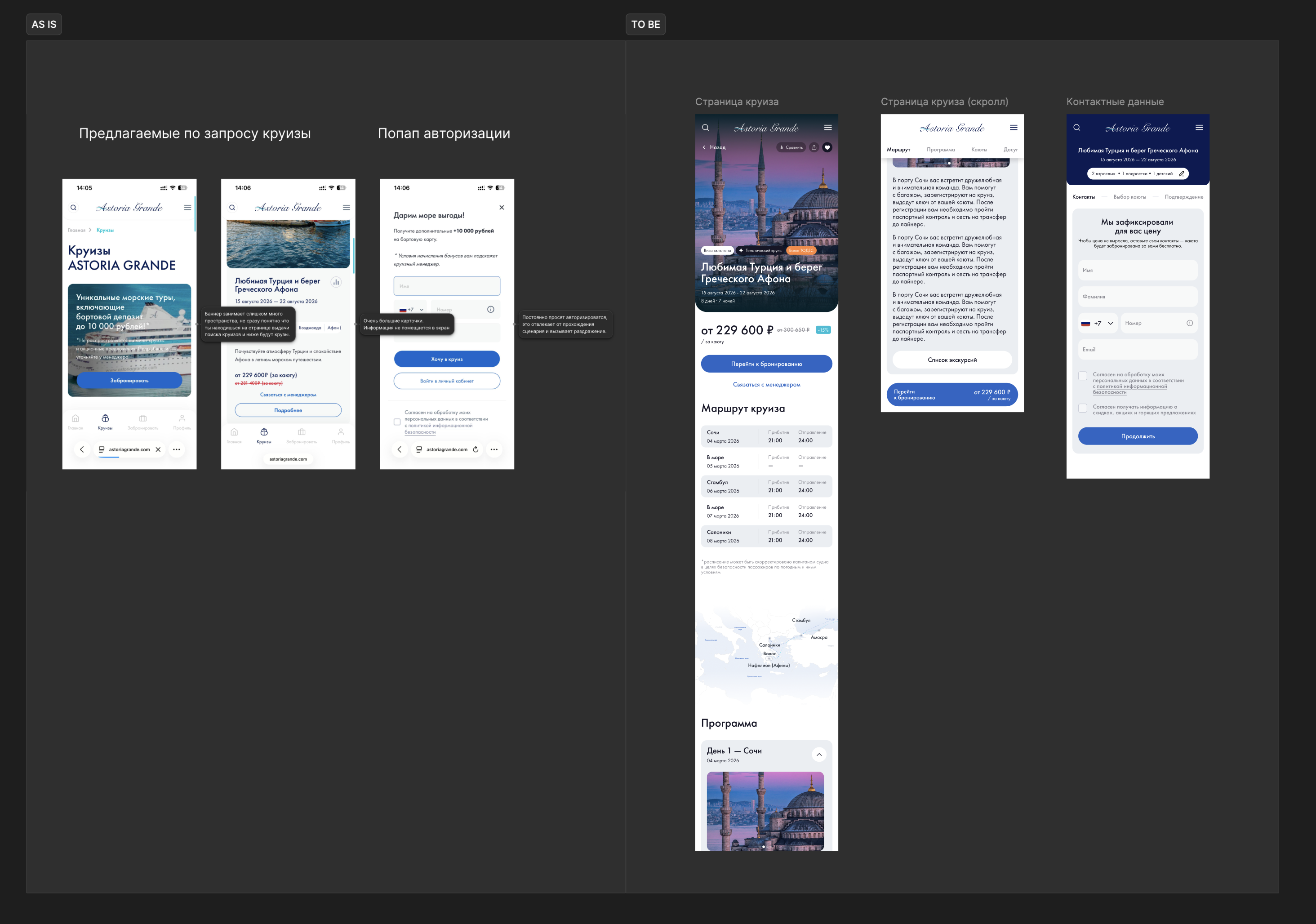
Cruise page and contact details: AS IS → TO BE
Visual difference instead of a table
The old screen — a table with cabin types and prices, no photos, no visual difference between categories. Users don’t understand what they’re paying extra for.
Cabin cards with photos, key features, and pricing. The difference between categories is visible visually, not just in text. A separate cabin page with description, layout, and amenities. On mobile — vertical scroll with a fixed selection button.
Target metrics: upgrade rate (choosing above base cabin) → target +10%. Drop-off on cabin selection screen → target −15%.
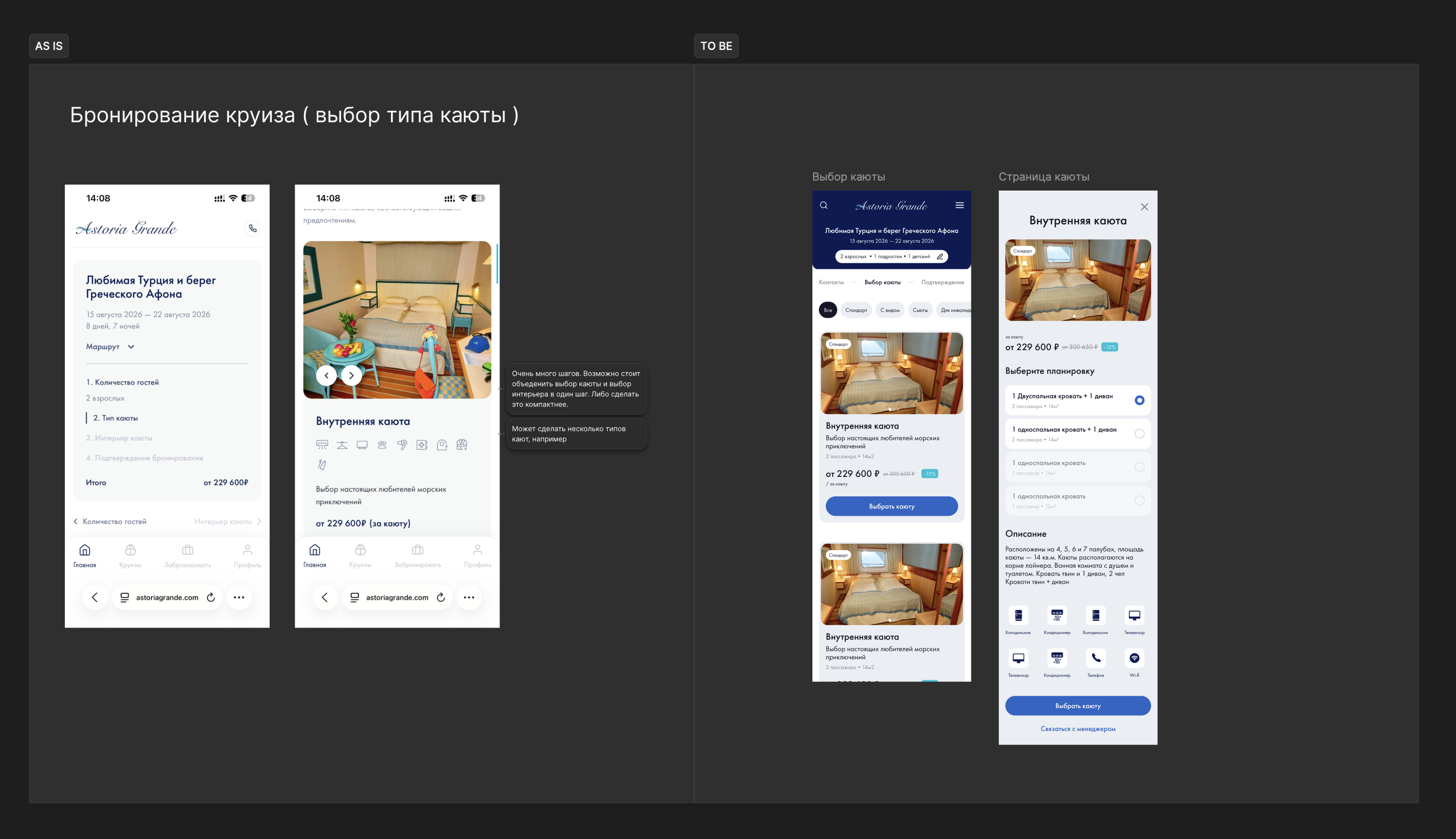
Cabin selection and cabin page: AS IS → TO BE
Authorization: closer to the end, not the middle
In the old flow, authorization sat in the middle — users had already invested effort but hadn’t reached confirmation. Mandatory registration is a major abandonment trigger (Baymard Institute: 24% abandon due to mandatory account creation).
Authorization was moved closer to the end, after cabin selection. Users have already invested in their choice — motivation to complete is higher. Contact details are collected in a minimal form, no unnecessary fields.
Target metrics: abandonment rate at authorization step → target −20%. Completed registrations → target +15%.
Emotional peak, not just a booking number
The old success screen — just text with a booking number. The emotional peak was missed: the user just purchased a vacation, but the interface doesn’t celebrate it.
A screen with visual confirmation: selected cruise details, cabin, route, price with discount. All details on one screen, with editing capability. Users see exactly what they booked and feel a sense of completion.
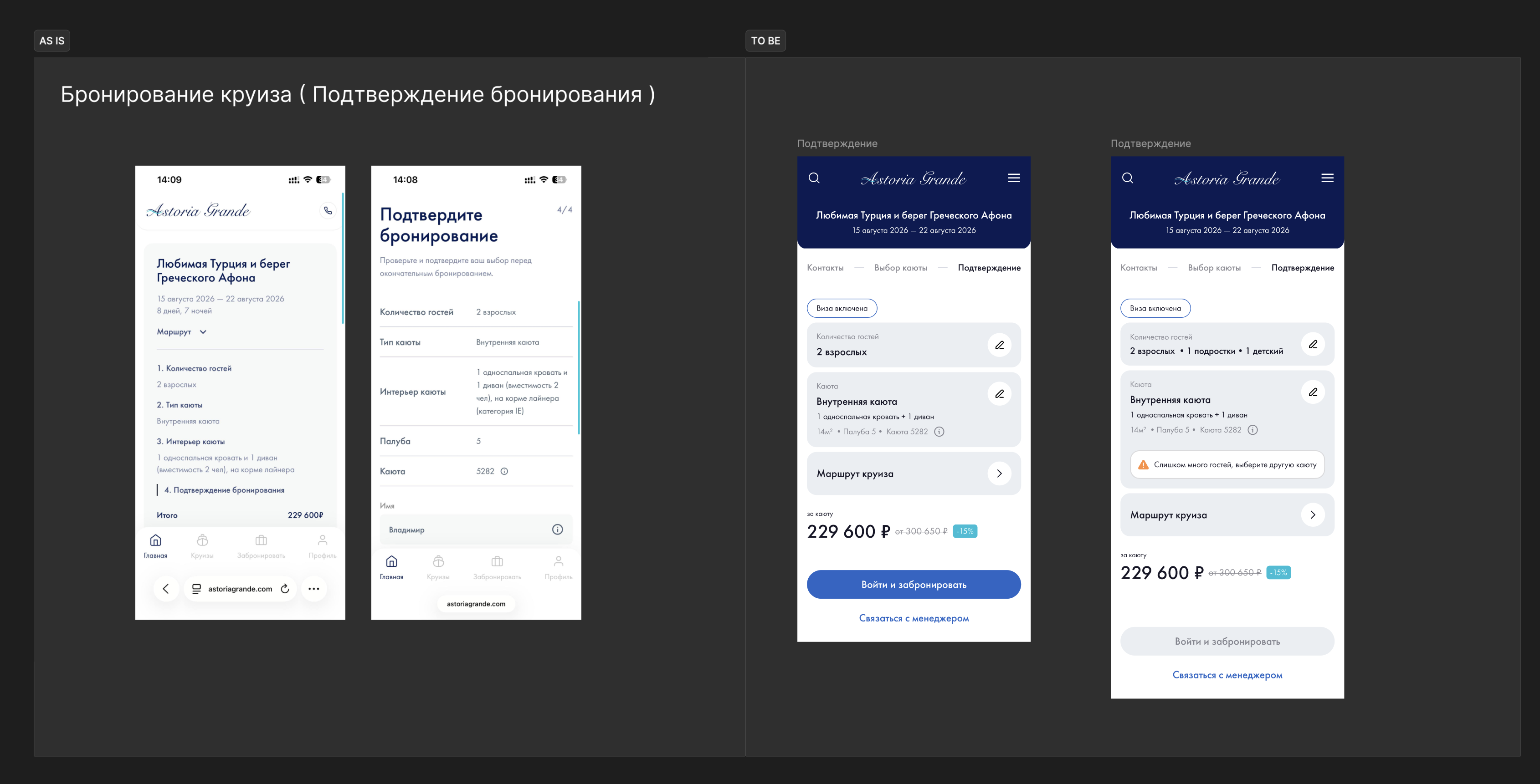
Booking confirmation: AS IS → TO BE
What was achieved
Over the course of the project:
— Conducted a full UX audit of the mobile booking flow — Designed a new user journey using the AS IS → TO BE methodology — Redesigned 6 key screens: home, search, cruise page, cabin selection, authorization, confirmation — Added a full cruise page that previously didn’t exist — Optimized authorization placement in the funnel to reduce drop-off — Defined metrics for A/B testing each stage
The project is in development. Target metric — 15% increase in end-to-end booking funnel conversion.
Overall validation plan: end-to-end conversion from homepage to confirmation. Baseline metrics captured 4 weeks before release, compared 4 weeks after. A/B test on 20% traffic before full launch. Key success metric: overall booking funnel conversion → target +15%.