Reimagining the Fun&Sun Platform
End-to-end redesign of a digital platform for one of Russia's largest tour operators. UX research, key scenario design, design system, and a section-by-section overhaul — from homepage to mobile app
About the project
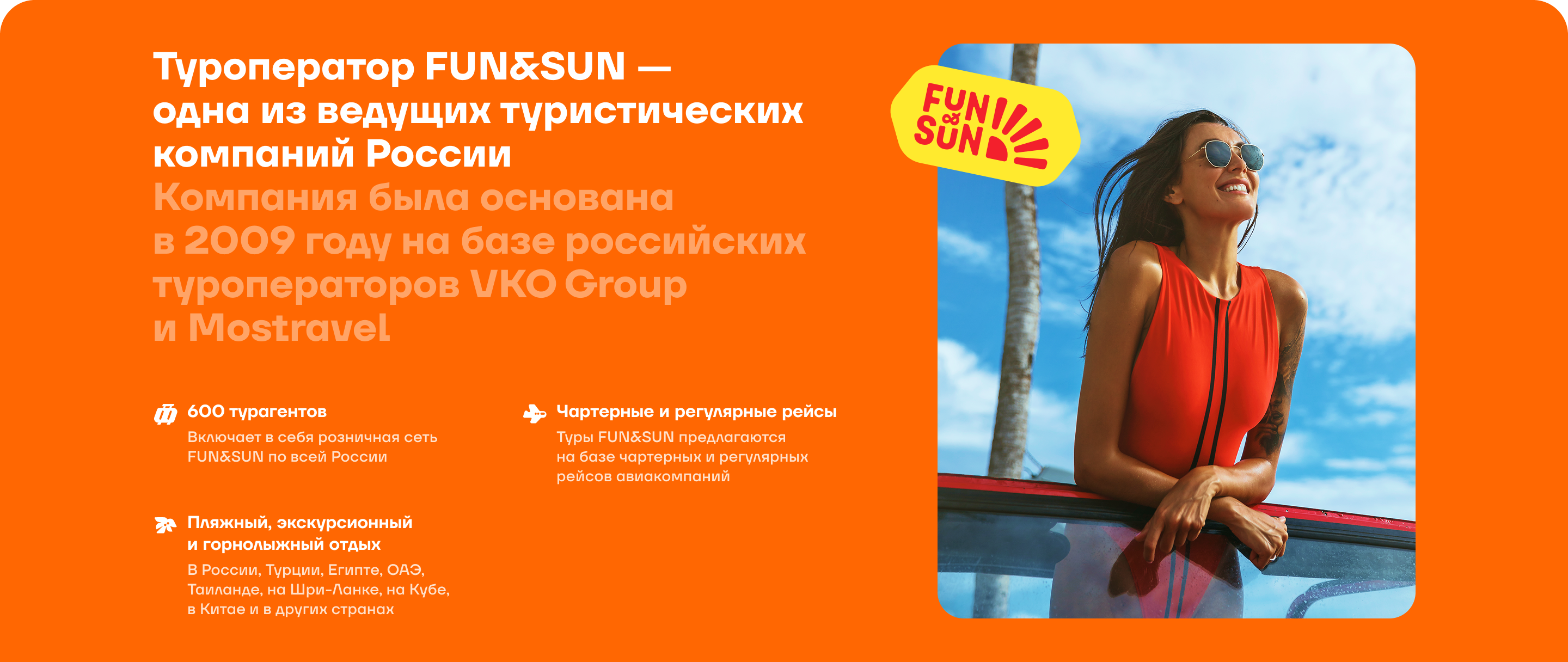
Fun&Sun is a top-5 tour operator in Russia. Package tours, excursions, cruises, flights — the company covers the entire travel cycle. Their platform handles thousands of bookings daily, but was falling behind competitors in terms of UX and visual quality.
The Fun&Sun team came to Utopia agency with a clear brief: bring the digital product in line with the brand's ambitions. The scope of responsibility included UX research, key user flow design, and building the design system.
Two weeks without Figma
The first step was not Figma, but analytics. The team went through Yandex.Metrica and session recordings, analyzed click maps, and identified where users were getting stuck.
A series of in-depth interviews was conducted with three audience segments: families with children, young couples, and independent travelers. Each behaves differently: some prioritize reliability, others want visual inspiration, and others need search speed and filter flexibility.
Competitors were also analyzed — Aviasales, Level.Travel, OnlineTours, Tui. Not to copy, but to understand which patterns had become industry standards and where there was room for differentiation.
Key findings
After the audit, the pain points became clear:
— Navigation overload: too many sections, unclear hierarchy. Users don't know where to click — Booking funnel is too long and confusing — too many steps from tour selection to payment — Visual inconsistency: each section looks like a separate product — Mobile experience significantly lags behind desktop — despite growing mobile traffic — Aggressive marketing communications: pop-ups, banners, spam — instead of helpful recommendations
Evolution, not revolution
The temptation was strong — tear everything down and redesign from scratch. But the platform works, generates revenue, and users have formed habits. A radical redesign always carries risk: conversion might drop, and the dev team might not handle the volume of changes.
The team proposed a different approach:
1. Rework the existing design system to match the new visual style — a unified foundation for the entire platform 2. Simultaneously make targeted improvements in the current design (quick wins) to show results before the big update 3. Sequentially update section by section, validating each change with A/B tests
This approach allowed delivering early results and building client trust before moving to larger-scale changes.
Design system: evolution, not a blank slate
Fun&Sun already had a design system — but it was outdated, with accumulated inconsistencies. The site used 14 shades of gray and 6 variations of the same button. The task wasn't to build from scratch, but to rework the existing foundation to match the new visual style and communications.
Work proceeded in two parallel tracks: designing new screens while simultaneously actualizing the design system. Tokens were updated (colors, typography, spacing, border-radius), components were brought to a unified standard — auto layout, variants, states. Every new screen stress-tested the system: if a component didn't cover a scenario, it was refined rather than creating a one-off solution. Developer documentation ran in parallel: not just 'here's a mockup' but 'here's how it works and why'.

Design system component overview and structure
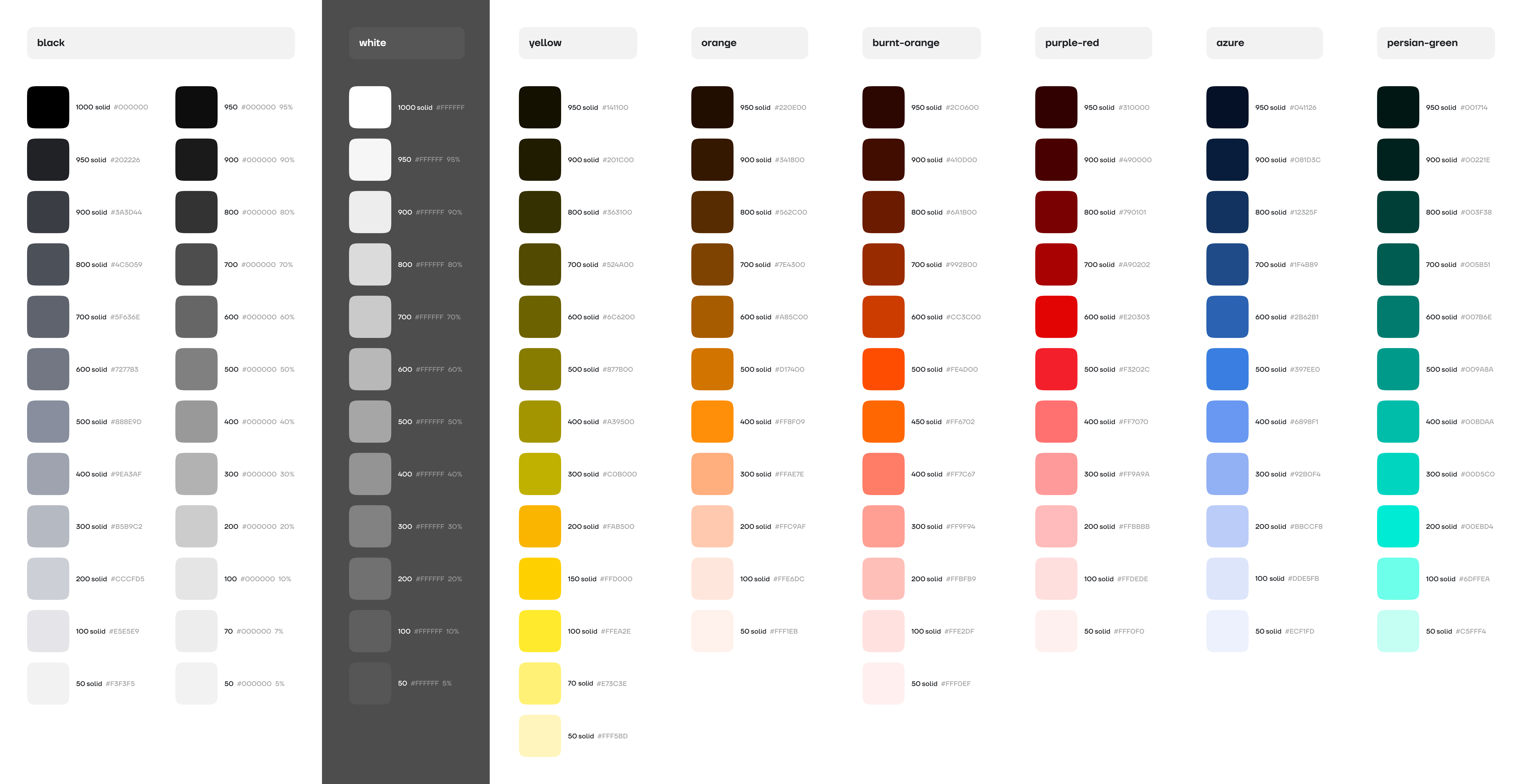
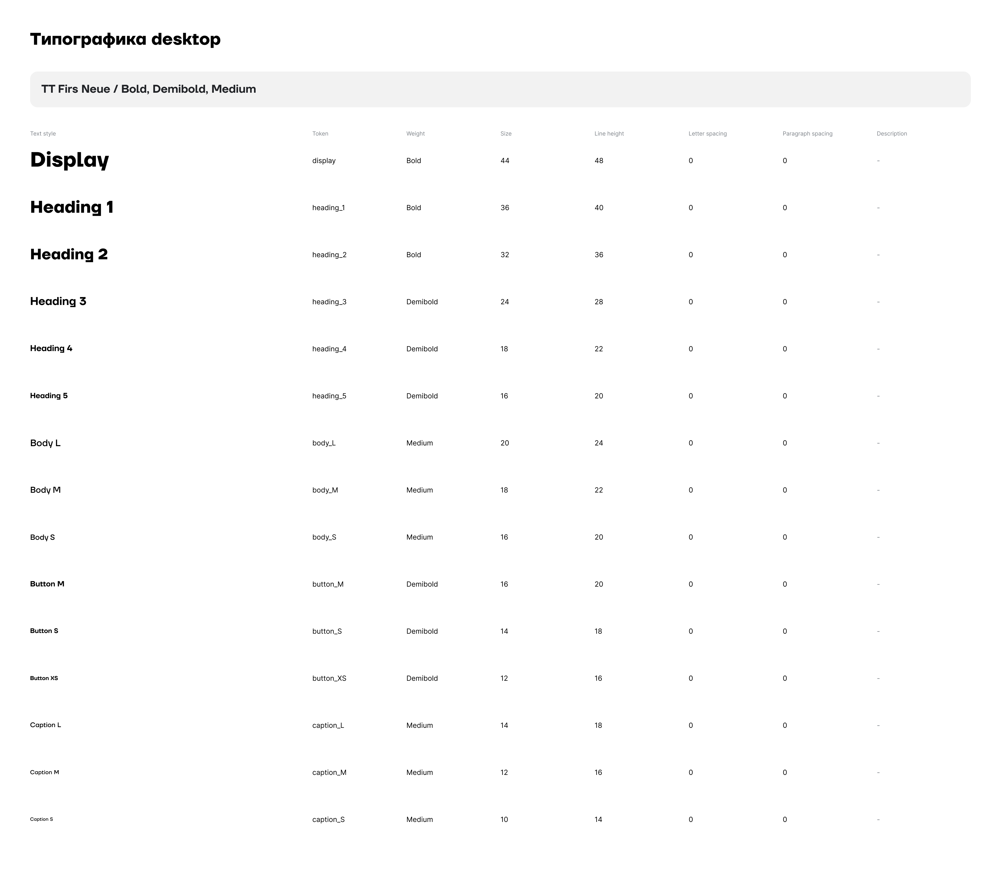
Color primitives and typographic scale
Brand and communications: digital adaptation
The client's brand book had basic guidelines but no digital application rules. The visual language was adapted for interfaces: color usage rules were defined, accent hierarchy was established, and the style for promotional communications was developed. All these decisions fed directly into the updated design system — tokens and components reflected the new branding.
A separate story — marketing communications on the platform. The team convinced the client to move away from aggressive pop-ups toward contextual collections and non-intrusive recommendations. The user comes for vacation — the interface should support that feeling, not destroy it.
Updated brand book adapted for digital products
New approach to marketing communications within the platform

Banners and promo materials in the updated style
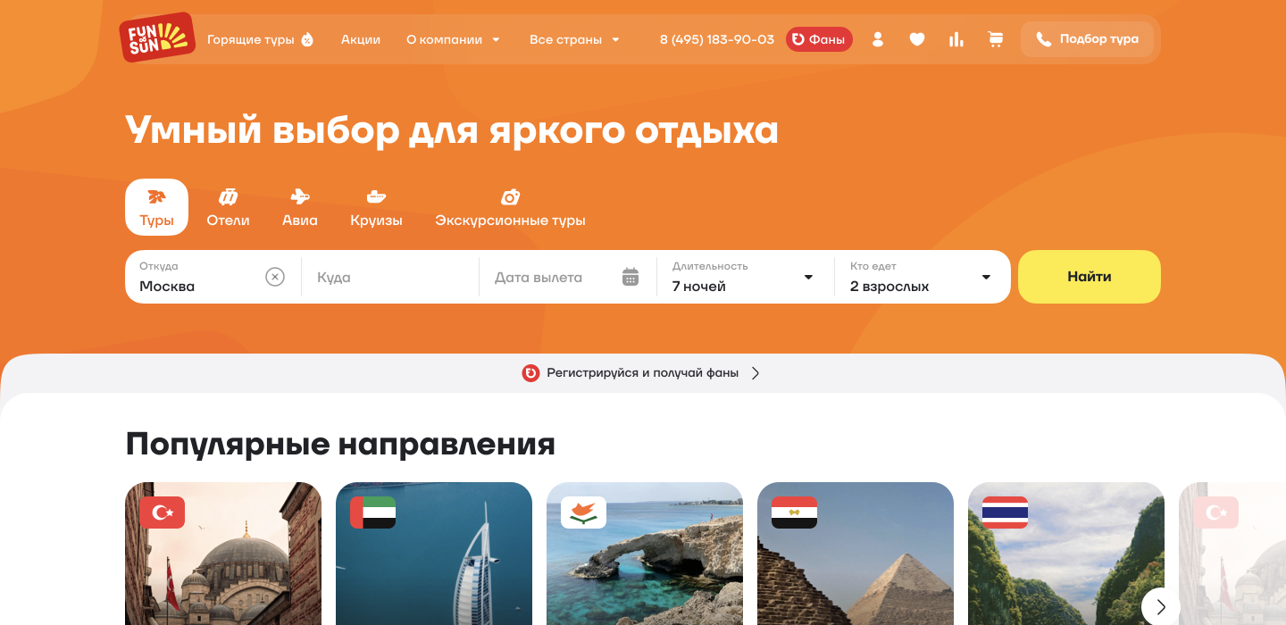
Homepage: remove noise, keep essence
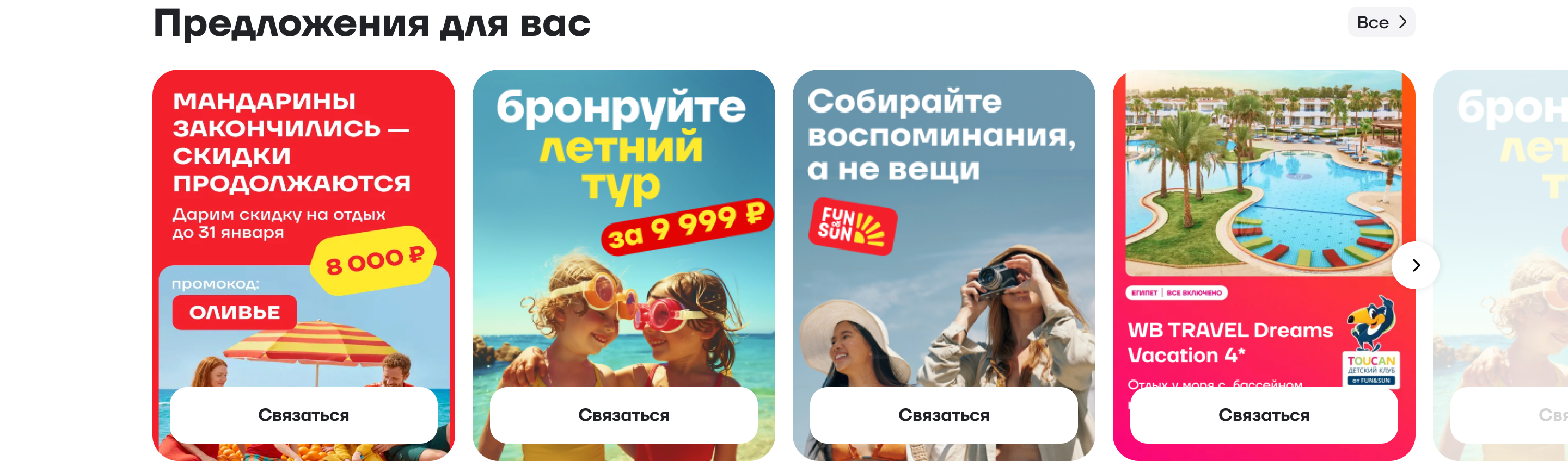
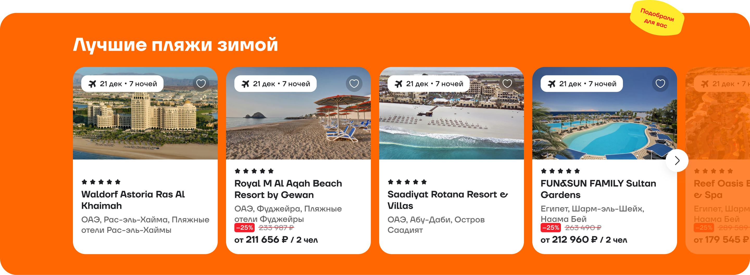
The old homepage tried to tell everything at once: promotions, destinations, special offers, blog, collections — and ended up saying nothing. The user comes with one task — find and book a trip. Everything else should support that task, not distract from it.
Three hero variants were tested with real users: information-dense, promo-oriented, and minimalist with search focus. The third won — by interaction speed and subjective usability ratings.
Below search, engagement blocks were built: popular destinations, vacation formats, seasonal collections — but without visual pressure, with clean rhythm and breathing room.
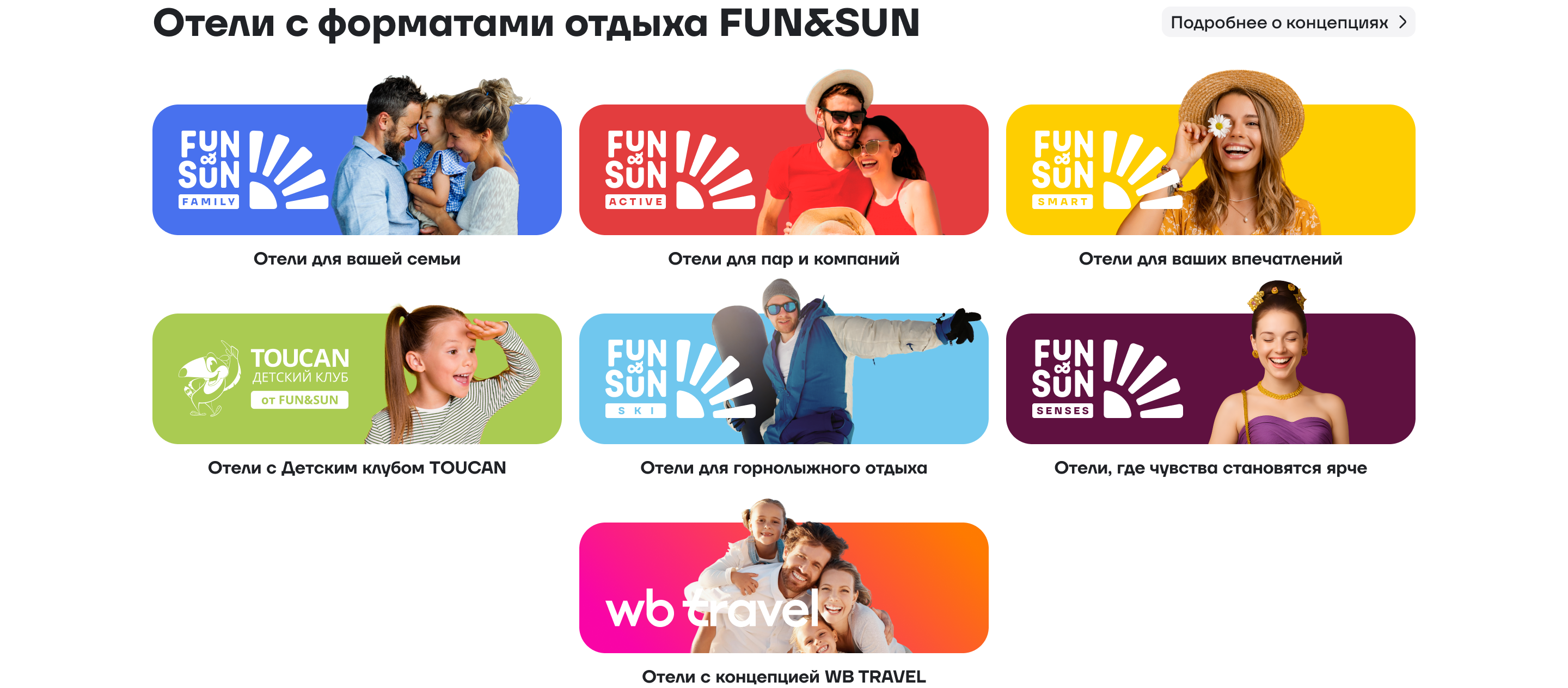
Engagement blocks: popular destinations and vacation formats
Fun&Sun vacation format showcase
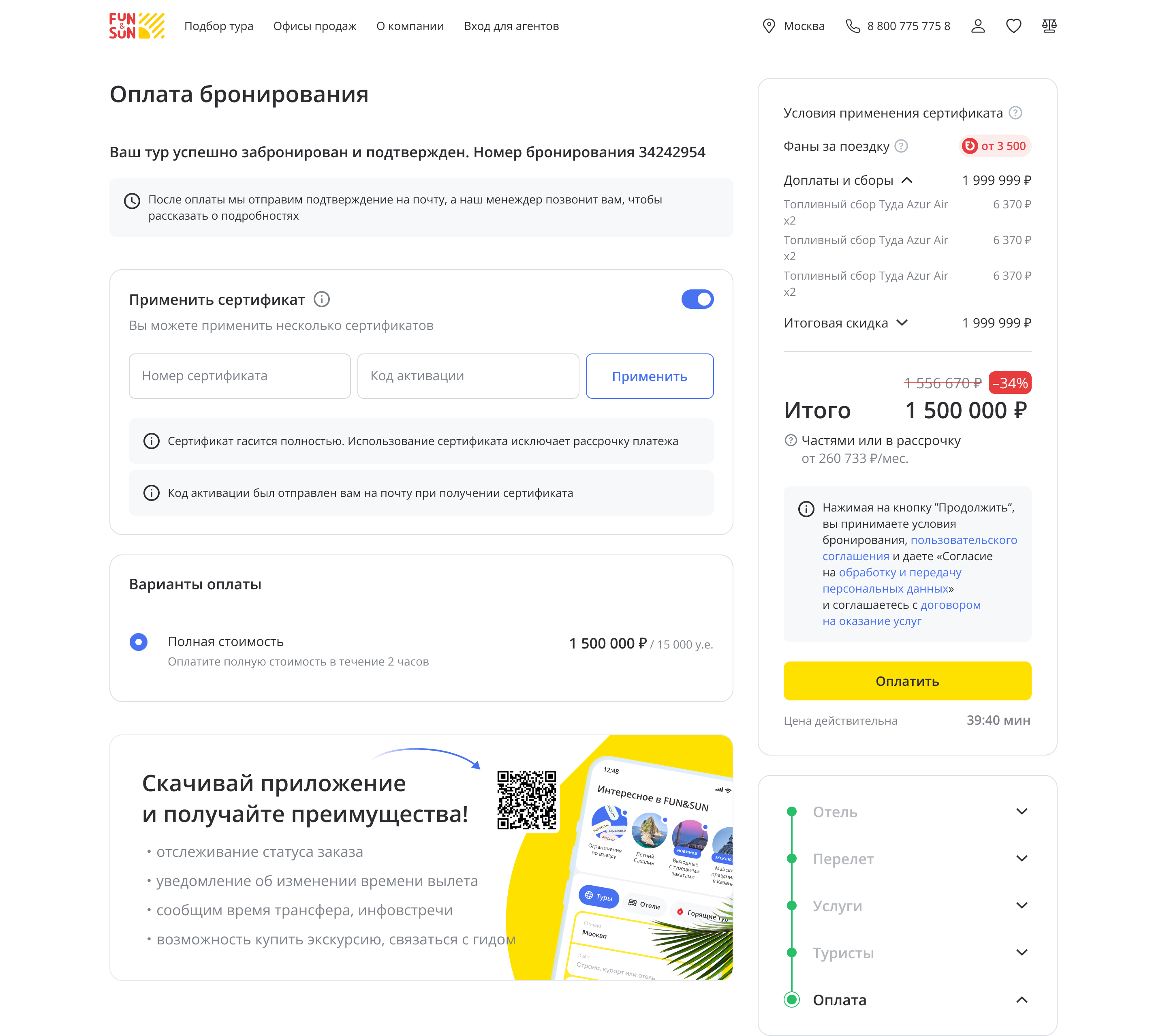
Booking: from 7 steps to 4
The cart was the most complex and valuable part of the project. This is where money converts — or gets lost. The old version took 7 screens from tour selection to payment. Each step meant drop-off.
The flow was redesigned: steps that could be combined without losing clarity were merged, duplicate information was removed, and contextual hints were added. Result — 4 steps instead of 7.
A separate challenge — the add-on services block (transfers, insurance, excursions). Competitors didn't have this, so the patterns were designed from scratch. The key principle: suggest, don't push. Users should see the value of add-ons, not feel pressure.
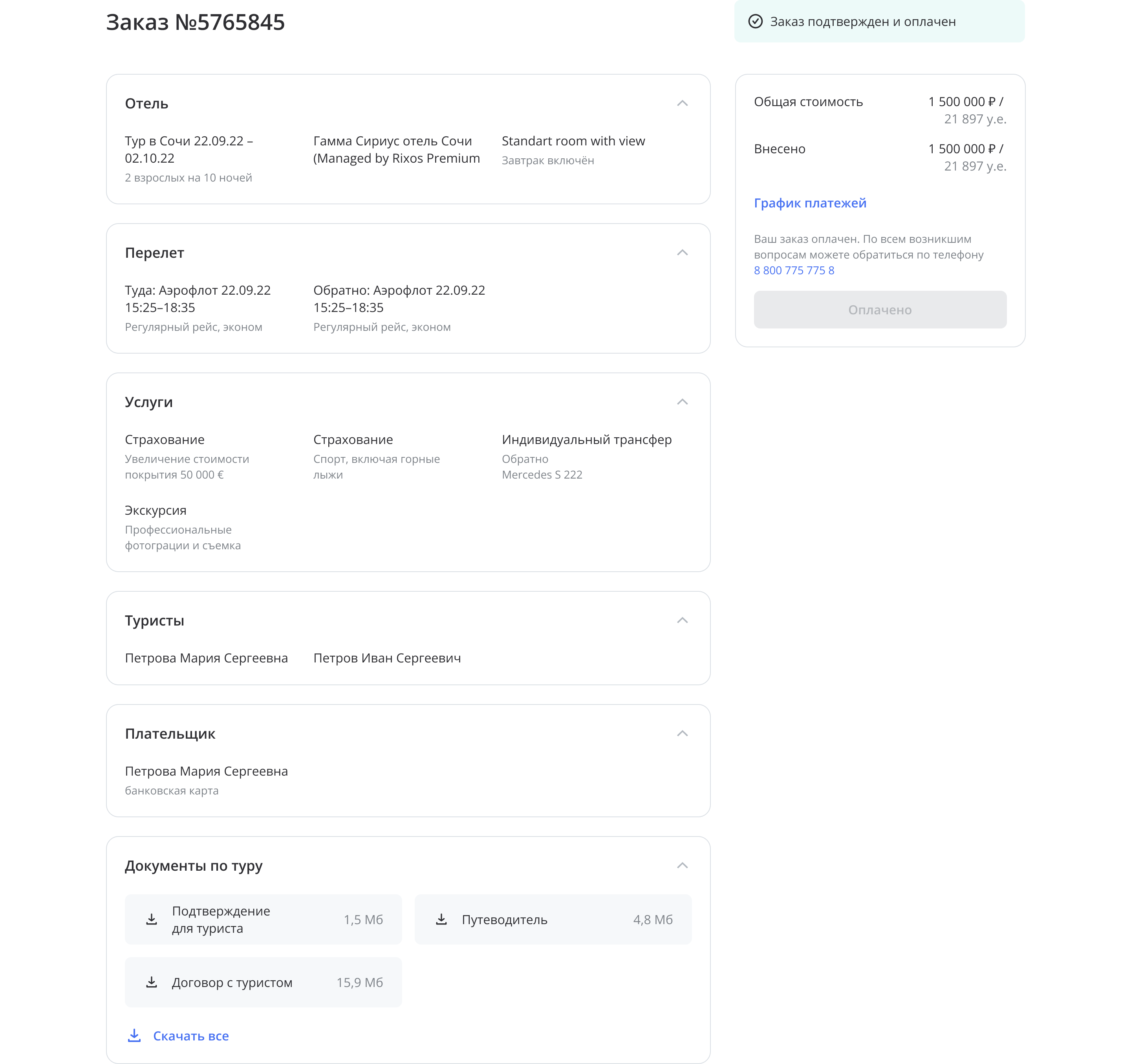
Redesigned order summary page with transparent structure
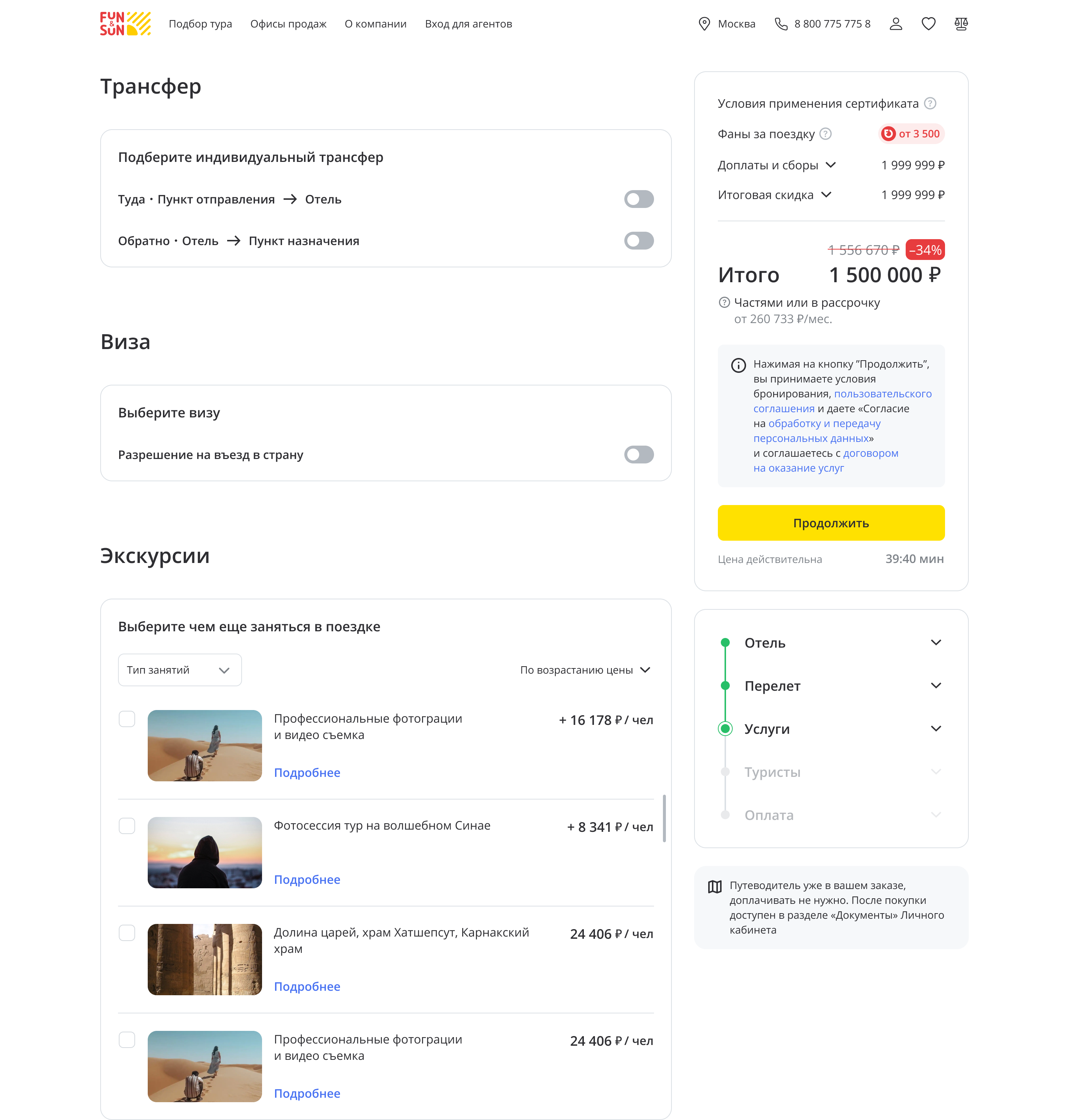
Add-on services block: transfers, insurance, excursions
Hotel card: more visual, less noise
The hotel card is where users decide 'go or not'. The old version had lots of text but little feeling. Photos were small, key info (rating, beach distance, meal type) got lost.
Work on this screen started even before the big redesign — as a quick win. The gallery was enlarged, key characteristics were moved into the hero block, and social proof was added (reviews, ratings). For the mobile app, a separate Hotel Only card was designed with focus on photos and per-night pricing.
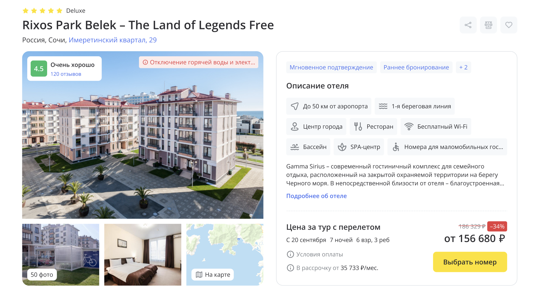
Redesigned hotel card with expanded gallery and key information
Search: the heart of the product
Search results — the screen where users spend the most time. The old version was a dense list with small photos and overloaded cards. Filters were hidden in a modal.
Critical filters were moved to the top of the page (price, rating, meal type), card photos were enlarged, and lazy-loading was added for faster performance.
The map went from a supporting tool to a full-fledged scenario: with marker clustering, on-map filtering, and the ability to compare hotels without page transitions.
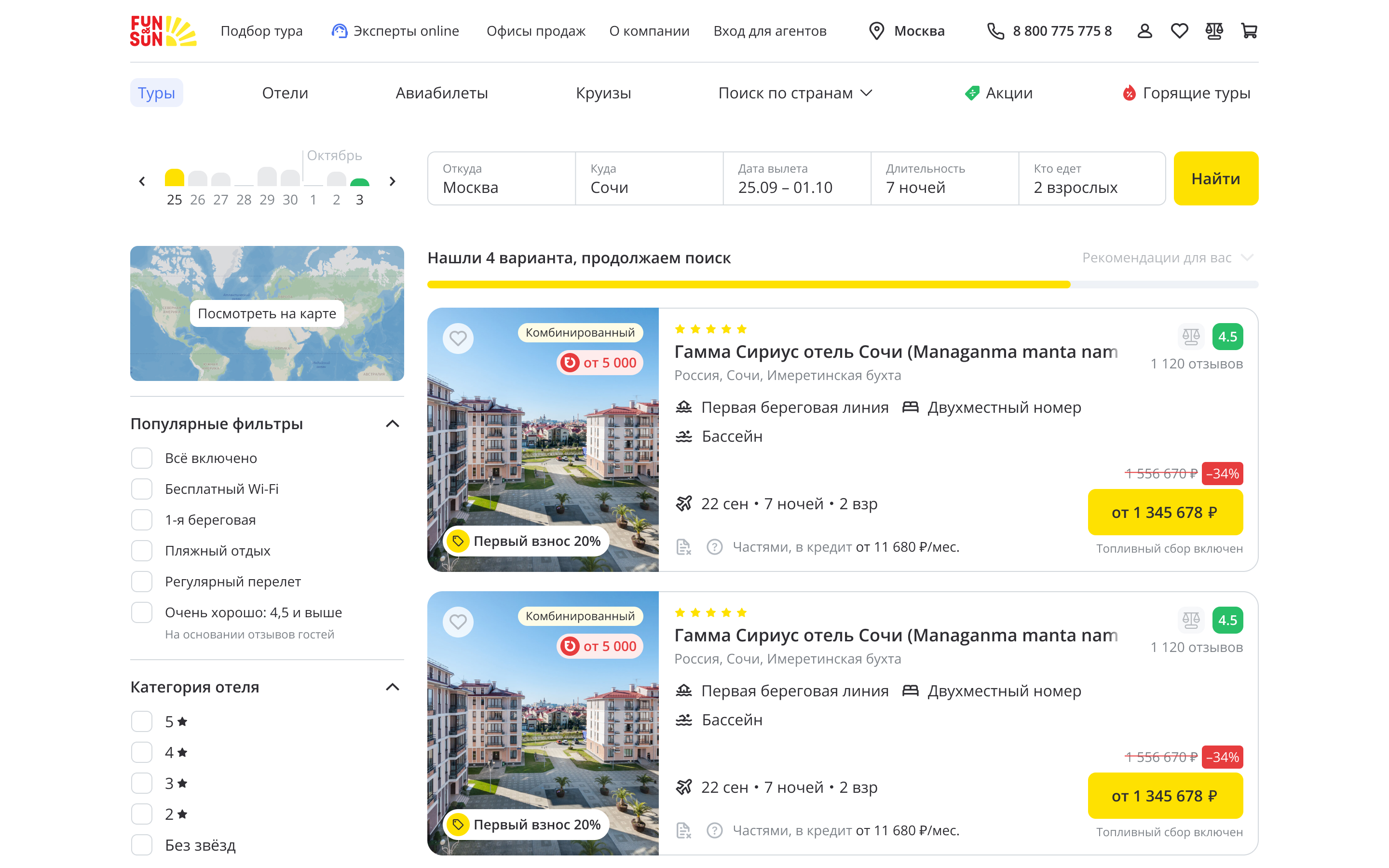
Updated search results with larger cards and exposed filters
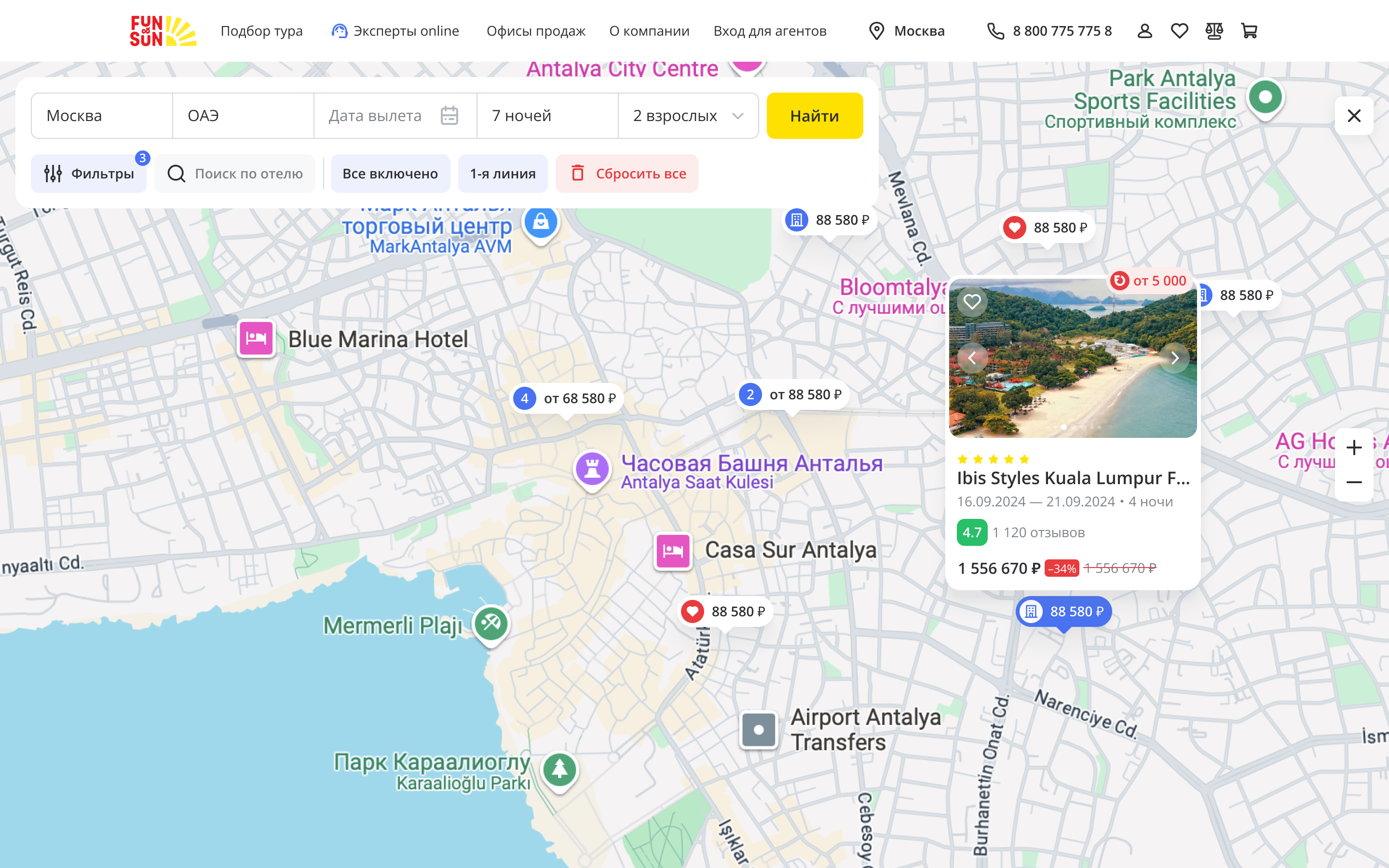
Map as a standalone search scenario
Mobile: a separate product, not a shrunken desktop
The mobile version is not 'desktop, but smaller'. It's a different usage context with different priorities. Mobile users scroll more, click filters less, and rely more on visuals. Excursion tours and cruises had full landing pages on desktop, but just a list on mobile.
A mobile first-screen was designed for each section with a visual anchor and convenient category navigation. In parallel, the Fun&Sun app was updated: hotel cards were redesigned, filters were adapted, and the mobile channel was brought to the same level as the website — same capabilities, same level of polish.


Excursion tours, cruises and app home screen
Certificates and promo mechanics
A separate task — gift certificates. The purchase flow was refined, and the ability to apply multiple certificates to a single order was added (previously impossible). A separate scenario was created for corporate clients — corporate gifts.
An 'Early Booking' promo mechanic was also prepared with cart integration and clear value communication for the user.
Redesigned gift certificate interface
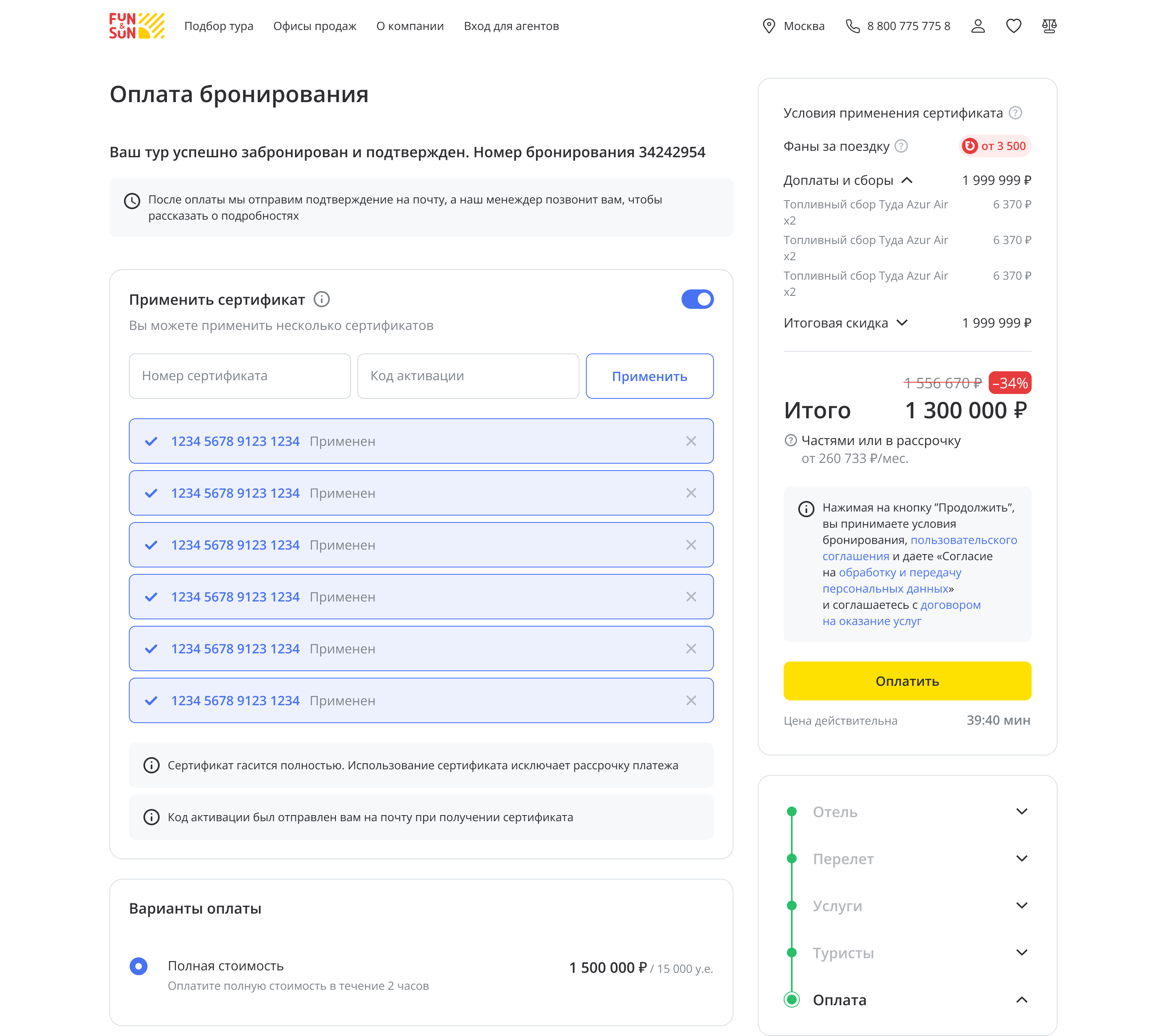
Applying multiple certificates to a single order
What was achieved
Over the course of the project:
— Reworked the design system: updated tokens, components, documentation — Redesigned 10+ key platform sections — Reduced booking funnel from 7 to 4 steps — Conducted multiple waves of UX research and A/B tests — Unified the experience across two platforms: web and mobile app — Transformed marketing communications from 'spam' to 'helpful'
Fun&Sun became a visually cohesive product — users navigate between sections and understand it's one platform. The client continued developing the product based on the updated design system.